A macOS like dockbar component made with Web Components
that can be used in any framework.



-
NPM
npm install dockbar --save
-
CDN
ESM(Example)
<head>
  <script type="module" src="https://unpkg.com/dockbar@latest/dockbar.js"></script>
</head>
IIFE(Example)
<head>
  <script src="https://unpkg.com/dockbar@latest/dockbar.iife.js"></script>
</head>
Go to Codepen for a quick try.
<body>
  <dock-wrapper>
    <dock-item>1</dock-item>
    <dock-item>2</dock-item>
    <dock-item>3</dock-item>
    <dock-item>4</dock-item>
  </dock-wrapper>
</body>
It is recommended to use a custom element inside dock-item, so that you can customize the content of dock-item.
<dock-wrapper>
  <dock-item>
    <div class="my-element"></div>
  </dock-item>
</dock-wrapper>
Set width on an individual dock-item when that item should be wider than the shared size.
<dock-wrapper size="40">
  <dock-item>1</dock-item>
  <dock-item width="96">Search</dock-item>
  <dock-item>3</dock-item>
</dock-wrapper>
Reactive width and height changes animate by default. Configure that per item with
resize-duration, resize-exit-duration, and resize-ease:
<dock-item
  width="96"
  resize-duration="240"
  resize-exit-duration="160"
  resize-ease="cubic-bezier(0.22, 1, 0.36, 1)"
>
  Search
</dock-item>
Durations are expressed in milliseconds. Set either duration to 0 to make that direction immediate.
Use dock-separator to split a dock into blocks. The separator occupies layout space and follows the wrapper direction, but it is not included in the hover scale effect.
<dock-wrapper>
  <dock-item>Finder</dock-item>
  <dock-item>Safari</dock-item>
  <dock-separator></dock-separator>
  <dock-item>Trash</dock-item>
</dock-wrapper>
You may need to look at docs if you are using a framework like Vue.js or React.
Apply class to dock-wrapper and dock-item and customize your own style.
Use the named indicator slot for badges, running dots, or other decorations that should follow an item's layout position without inheriting its magnification:
<dock-item>
  <button>Mail</button>
  <span slot="indicator" class="running-indicator"></span>
</dock-item>
The indicator layer fills the current dock-item footprint and is exposed as ::part(indicator). Its slotted content is not placed inside the scaled visual container, so a 4px indicator remains 4px while the icon grows.
For more, see Configuration.
Set sortable to enable drag reordering. Set allow-drag-delete if dropping an item outside the dock should emit a delete event instead of snapping back.
When a sortable dock contains dock-separator, each separator creates a block. Items can only be dragged within their original block; dragging across a separator is treated as an invalid drop and snaps back.
<dock-wrapper id="dock" sortable allow-drag-delete>
  <dock-item data-id="launchpad">Launchpad</dock-item>
  <dock-item data-id="mail">Mail</dock-item>
  <dock-separator></dock-separator>
  <dock-item data-id="music">Music</dock-item>
</dock-wrapper>

<script>
  const dock = document.querySelector('#dock')

  dock.addEventListener('on-sort', (event) => {
    const { oldIndex, newIndex } = event.detail
    console.log('sort', oldIndex, newIndex)
  })

  dock.addEventListener('on-delete', (event) => {
    const { index, item } = event.detail
    console.log('delete', index, item.dataset.id)
  })
</script>The optional dockbar/minimize entry adds a managed macOS-style minimized-window area. It snapshots any mounted element, animates it through a document-level Genie canvas, and restores it when its Dock thumbnail is clicked.
import 'dockbar'
import 'dockbar/minimize'
Declare the separator explicitly so the minimized area can be placed wherever your Dock design needs it.
<dock-wrapper>
  <dock-item>Finder</dock-item>
  <dock-item>Mail</dock-item>
  <dock-separator></dock-separator>
  <dock-minimize-area id="windows"></dock-minimize-area>
</dock-wrapper>
Registering a window returns a persistent handle. The source may be an element or a getter when a framework owns the ref.
const area = document.querySelector('dock-minimize-area')
if (!area)
  throw new Error('Missing dock-minimize-area')

const mail = area.registerWindow({
  id: 'mail',
  label: 'Mail',
  source: () => document.querySelector<HTMLElement>('#mail-window'),
})

minimizeButton.addEventListener('pointerenter', () => mail.prepare())
minimizeButton.addEventListener('pointerleave', () => mail.cancelPrepare())
minimizeButton.addEventListener('click', () => mail.minimize())

// The thumbnail restores automatically when clicked. Application icons can
// restore the same window explicitly.
mailIcon.addEventListener('click', () => area.restore('mail'))
DockMinimizeArea is still an HTMLElement: importing dockbar/minimize defines that custom-element subclass and augments HTMLElementTagNameMap, so TypeScript knows that a dock-minimize-area query has methods such as registerWindow(). If you query by an ID-only selector, annotate it explicitly:
import type { DockMinimizeArea } from 'dockbar/minimize'

const area = document.querySelector<DockMinimizeArea>('#windows')
prepare() starts a reusable snapshot before the click so capture latency does not delay the animation. Calling minimize() without preparing is also supported.
For a one-off integration, the area exposes the same operation directly and retains the resulting handle by id:
await area.minimize({
  id: 'notes',
  label: 'Notes',
  source: notesWindow,
})
await area.restore('notes')
The area keeps registrations until unregisterWindow(id) or handle.dispose() is called. getWindow(id) returns an existing handle. Handle state is one of idle, minimizing, minimized, restoring, or disposed; repeated calls for the current stable state are safe.
The default visibility adapter keeps the source mounted and temporarily applies visibility: hidden, pointer-events: none, inert, and aria-hidden, restoring the exact previous inline state afterward. Framework integrations that own visibility may provide an asynchronous adapter:
const handle = area.registerWindow({
  id: 'editor',
  source: () => editorElement.value,
  visibility: {
    async setHidden(hidden, { source }) {
      await updateFrameworkState(hidden)
      source.dataset.minimized = String(hidden)
    },
  },
})
Do not unmount the source while it is minimized. Call invalidatePreparedSnapshot() after content changes that should invalidate a prepared capture; geometry and scroll changes are detected automatically.
Use data-dock-snapshot-ignore to exclude video, iframe, private, or otherwise uncapturable descendants. Per-window capture.filter and capture.onCloneNode hooks are also available for custom snapshot handling.
The add-on respects prefers-reduced-motion, supports all four Dock positions, and permits multiple minimized windows. Thumbnails initially follow minimize order. When the parent dock-wrapper is sortable, they can be reordered inside the minimize area, but cannot cross its explicit separator. Thumbnail reorders stay internal and do not emit the wrapper's on-sort or on-delete events.
Generated previews expose ::part(item), ::part(button), and ::part(thumbnail). Their button cursor defaults to default; consumers can opt into pointer, grab, or another cursor through dock-minimize-area::part(button).
CDN users should load the core bundle first and the add-on second:
<script src="https://unpkg.com/dockbar@latest/dockbar.iife.js"></script>
<script src="https://unpkg.com/dockbar@latest/dockbar.minimize.iife.js"></script>There are some problems yet to be solved:
- SSR compatibility
It does not work will in SSR framework like Nuxt.js. For now you have to render it inside
ClientOnly, and import component asynchronously. - Style asynchronous loading causes a flash on init
If you are not using by
iife, it may cause a flash on init, because the style is loaded asynchronously. For now you could resolve this by applying a style:<head> #dock { visibility: hidden; } #dock:defined { visibility: visible; } </head> <body> <dock-wrapper id="dock"> </dock-wrapper> </body>
| Property | Type | Default | Description |
|---|---|---|---|
size |
number |
40 |
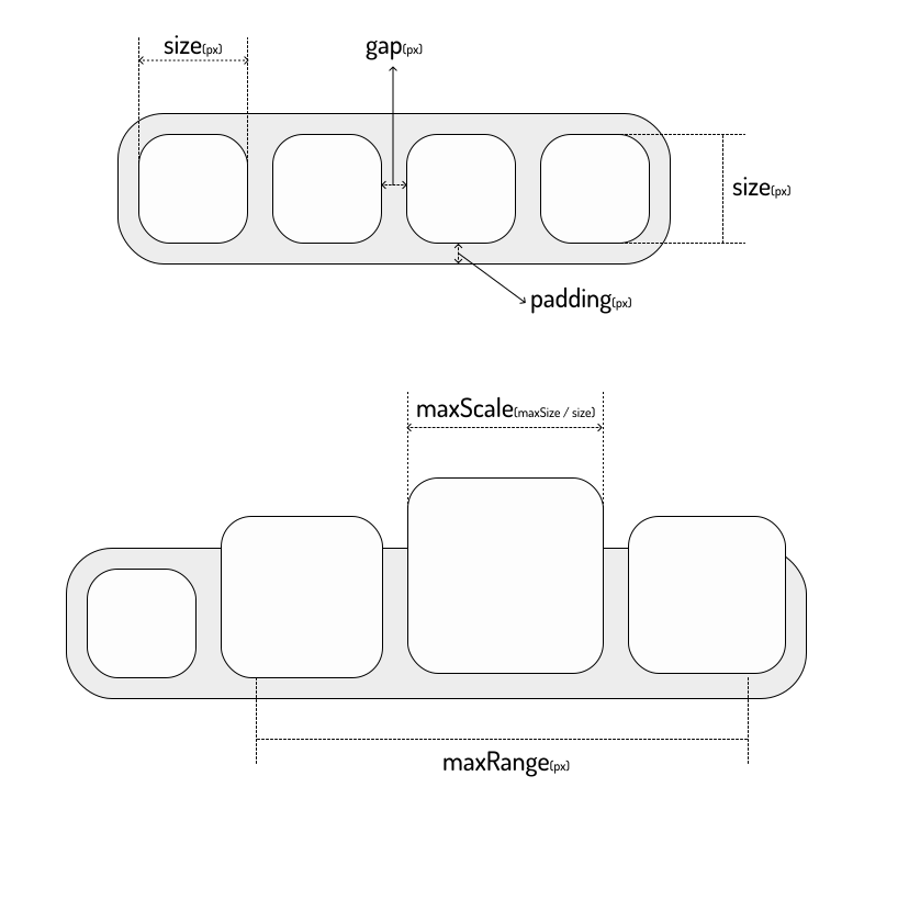
The base height of dock-item and fallback width in px, see Sizes |
width |
number |
size |
Optional per-dock-item base width in px |
height |
number |
size |
Optional per-dock-item base height in px |
resize-duration |
number |
200 |
Per-dock-item base-size expansion duration in milliseconds |
resize-exit-duration |
number |
160 |
Per-dock-item base-size contraction duration in milliseconds |
resize-ease |
string |
cubic-bezier(0.22, 1, 0.36, 1) |
Per-dock-item easing used by base width and height transitions |
padding |
number |
8 |
The padding of dock-wrapper in px, see Sizes |
gap |
number |
8 |
The gap between dock-items in px, see Sizes |
maxScale |
number |
2 |
The max scale of dock-item, see Sizes |
maxRange |
number |
200 |
The hover radius in px for the cosine-shaped scale effect |
disabled |
boolean |
false |
Disable the hover scale effect |
direction |
horizontal | vertical |
horizontal |
The layout direction of dock-items |
position |
top | bottom | left | right |
bottom |
The dock position, which affects the scale origin |
easing |
string |
cubic-bezier(0, 0.55, 0.45, 1) |
The easing used by dock-item scale animation |
sortable |
boolean |
false |
Enable drag reordering for dock items |
allow-drag-delete |
boolean |
false |
When sortable is enabled, allow dropping an item outside the dock to emit a delete event |
will-change |
boolean |
false |
Apply will-change hints to dock items for width and height |
| Property | Type | Default | Description |
|---|---|---|---|
thickness |
number |
1 |
The separator thickness in px along the dock's main axis |
dock-wrapper automatically provides size and direction to each dock-separator, so separators match the current dock orientation.
Emitted after a sortable drag ends with a changed order.
interface DockSortDetail {
  item: HTMLElement
  oldIndex: number
  newIndex: number
}Emitted when allow-drag-delete is enabled and an item is released outside the dock.
interface DockDeleteDetail {
  item: HTMLElement
  index: number
}
The component only emits the event. Removing the item from your application state is the responsibility of the parent app.
Emitted by dock-minimize-area whenever a registered handle changes state.
interface DockWindowStateChangeDetail {
  area: DockMinimizeArea
  id: string
  handle: DockWindowHandle
  previousState: DockWindowState
  state: DockWindowState
}Emitted by dock-minimize-area when capture or a transition fails. Calls made through the imperative API also reject their returned promise.
interface DockWindowErrorDetail {
  area: DockMinimizeArea
  error: unknown
  handle: DockWindowHandle
  id: string
  operation: 'prepare' | 'minimize' | 'restore' | 'dispose'
}